Rethinking Amazon's Account Health Dashboard
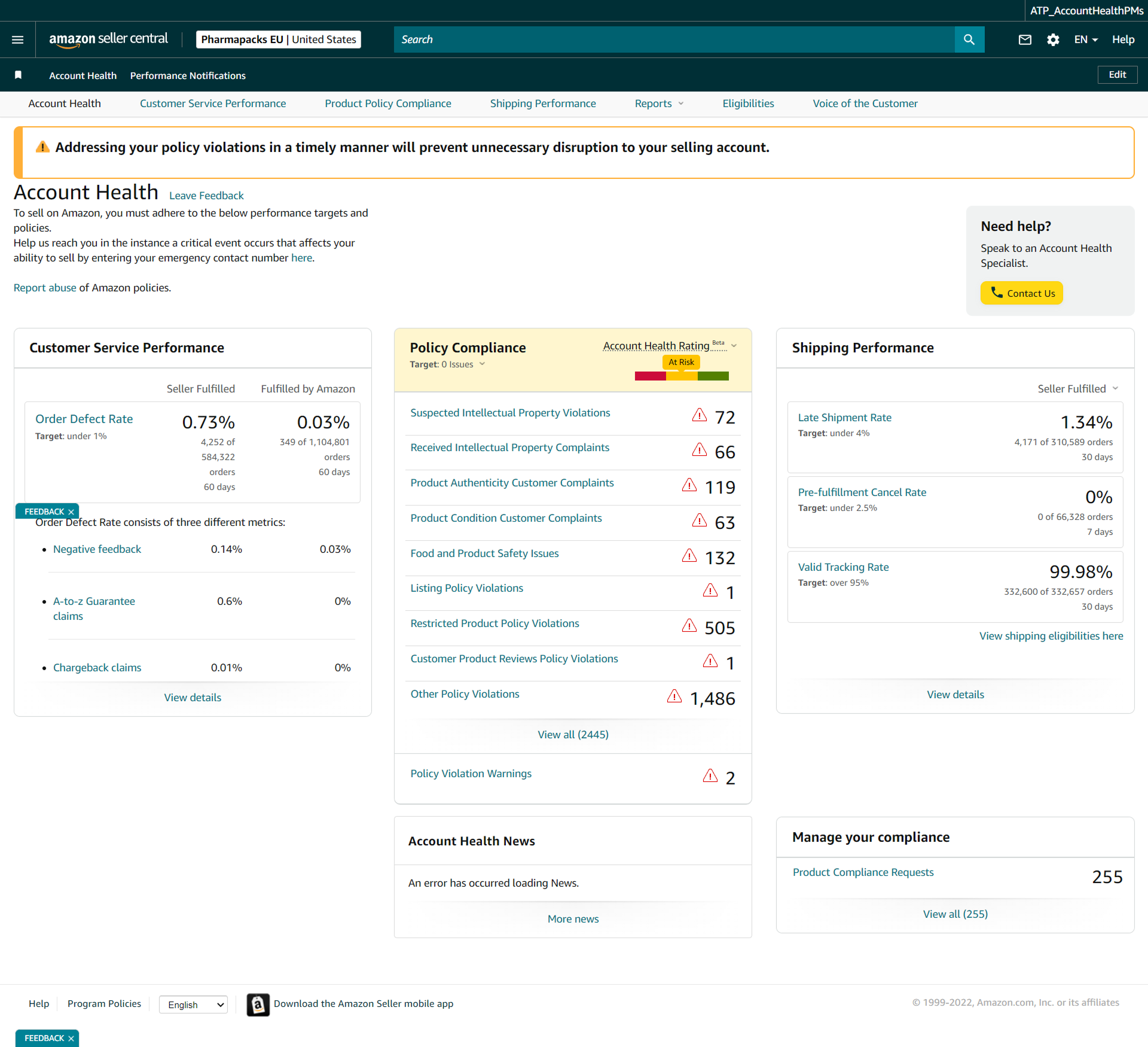
How critical account risk signals get buried in noise — and a principled system for surfacing what matters most.
Role
UX Designer
Heuristic Audit
Problem Framing
Design Solutions
Team
Solo
Solo consultant embedded with the Amazon team
Tools
Timeline
8 weeks — audit to spec
TL;DR — The Outcome
What shipped
- Deactivation warning buried among promotional widgets
- 2,445 violations sat in an unsorted list
- Audited the interface, framed four core problems
- Designed a priority-first system: 0–1000 health score, priority alerts, violation management, and guided resolution flows
My role
- Solo UX designer owning the full arc
- Heuristic audit, problem framing, design principles
- Specification of four interconnected solutions
- Embedded as a consultant with the Amazon team
Timeline
- Wk 1–2: Research & Audit
- Wk 3–4: Problem Framing & Principles
- Wk 5–7: Design Solutions
- Wk 8: Specification & Handoff
01 — Context
The Stakes Are Asymmetrically High
Millions of third-party sellers rely on Amazon Seller Central's Account Health Dashboard to monitor compliance, shipping, and service quality. Account deactivation can destroy a livelihood overnight — yet the interface communicating that risk was designed without urgency.
Sellers need a system that surfaces what matters most. Instead, they were given a report.
The critical alert — "Your account is at risk of deactivation" — appeared as one of nine equal-weight cards alongside an Amazon Business ad. A seller could scroll past it entirely.
02 — Research & Audit
What We Found
Heuristic evaluation, task analysis, cognitive load assessment, and seller forum review — applied against a live Figma capture of Seller Central.
Alerts Buried in Noise
Deactivation warning shares equal weight with a promotional ad. Zero hierarchy.
Fragmented Metrics
5 separate tabs to understand full account health. No unified view.
Overwhelming Violations
2,445 violations in a flat list. No filtering, bulk actions, or guided resolution.
Weak Action Guidance
Generic "View" and "Manage" buttons with no context on what to do next.
Mismatched Time Windows
ODR uses 60 days, Late Shipment 30 days, Cancel Rate 7 days — unexplained.
No Progress Indication
No appeal status, no resolution tracking, no distinction between active and resolved.

The existing Seller Central Account Health Dashboard — primary audit artefact
03 — Problem Framing
Four Problems Driving the Work
Before jumping to solutions — four interconnected problem statements, each representing a real seller pain point.
Account Health dashboard
⚠ Addressing your policy violations in a timely manner will prevent unnecessary disruption to your selling account.
⚠ Account at risk of deactivation
2 policy violations require action
Amazon Business: Grow your sales
Register for Amazon Business today
Account Health News
An error has occurred loading News.
Manage your compliance
Product Compliance Requests: 255
The deactivation alert competes with ads and news
The Invisible Emergency
Deactivation risk has the same visual weight as promotional content. Sellers spend 2–3 minutes on the dashboard and can miss critical alerts entirely.
HMW: Make deactivation risk impossible to ignore without crying wolf for minor issues.
Policy Compliance — violation list
View all (2445)
Every row looks equally urgent — no priority signal
Death by a Thousand Violations
2,445 violations in chronological order with no urgency weighting, bulk actions, or resolution guidance. Sellers can’t see which violations threaten their account most.
HMW: Transform a paralyzing list into a prioritized workflow that shows exactly what to do next.
Three separate cards, three silos
Customer Service Performance
Policy Compliance
At RiskShipping Performance
60 days, 30 days, 7 days — no unified view
The Disconnected Metrics Puzzle
Metrics live on separate pages with different time windows. Impossible to understand the full picture at a glance — sellers must navigate 5 tabs to connect the dots.
HMW: Provide a single, truthful view of account health that shows how metrics relate.
Actual CTAs from dashboard
Every link says “View details” — none says what to do
What Do I Do Next?
Generic action buttons, no step-by-step guidance, no success criteria. When sellers find a problem, they face a second challenge: understanding how to resolve it.
HMW: Guide sellers through resolution with clear steps, realistic expectations, and visible progress.
04 — Design Principles
Five Principles for High-Stakes Dashboards
Derived from the research phase and validated against dashboard patterns in financial trading, healthcare monitoring, and industrial control.
Urgency first.
The most urgent item dominates the viewport. A dashboard is a decision support tool, not a report.
Action over metrics.
Every metric paired with a recommended action — or confirmation that none is needed. Metrics without context create anxiety.
Progressive disclosure.
Health score first, then categories, then individual violations. Don’t show 2,445 rows when the seller needs “2 critical, here’s where to start.”
Status, not state.
Show how things are changing. Trend indicators and velocity (improving/worsening) matter as much as current values.
Earned clarity over opacity.
Explicit thresholds, clear consequences, honest communication. Trust-building, not anxiety-inducing.
05 — Before vs. After
The Core Design Decisions
Alert buried among 9 equal-weight cards
Deactivation warning has the same visual weight as a promotional ad.
Alert indistinguishable from other cards
Full-width sticky alert dominates the viewport
Critical state is impossible to miss — always visible at the top.
2 policy violations require immediate action
Full-width, color-coded by severity
No unified health score — seller must infer it
Metrics scattered across tabs with no composite view.
No way to see overall standing at a glance
Overall Health Score (0–1000) with breakdown
Single number communicates magnitude and direction.
Score, trend, and zone — one glance
2,445 violations in a flat chronological list
No filtering, no grouping, no urgency weighting.
… 2,440 more rows
Grouped by type, sorted by urgency, bulk-actionable
Sellers see where to start and can act on multiple at once.
Metrics fragmented across 5 separate tabs
Inconsistent time windows. No explanation of why they differ.
Each tab is a silo with its own time window
Single-page unified view with collapsible sections
Explicit time labels on every metric. Full picture in one scroll.
Generic CTAs with no status tracking
“View” and “Manage” buttons. No appeal status. No progress.
What do I do next?
Specific CTAs with appeal status tracking
Every violation has a clear next step and visible progress.
06 — Design Solutions
Four Systems That Work Together
Priority-Based Dashboard Architecture
Viewport restructured into three priority zones: Critical (sticky alert + health score, always visible), Active (metrics needing attention, collapsible), and Informational (trends, news, tools).
Any metric approaching 80% of its policy threshold, or any critical event
Full-width sticky banner with severity level: Critical (red), Warning (amber), Notice (blue)
One primary action button with specific label: "Review 2 Policy Violations" not "View Details"
Alerts cannot be permanently dismissed while the underlying issue persists
⚠ Critical — Account At Risk
Your account is at risk of deactivation · 2 policy violations require immediate action
Critical
At Risk
Fair
Good
Healthy
Visualization recreated for portfolio purposes — original assets are under NDA.
Intelligent Violation Management System
2,445 violations transformed from flat list into prioritized workflow — auto-sorted by impact, grouped by type for batch resolution, each with a specific next step.
Impact level (Critical → High → Medium → Low), then date within each level
By violation type with collapsible sections; each group shows count + resolution path
Select multiple violations of same type → batch appeal submission workflow
Requires Action / In Review / Appeal Submitted / Resolved — visible on every row
Inline expandable guide per violation type with exact steps, required documents, typical timelines
Key insight: IP Violations (72 cases) are the most urgent category, not because of count but because they are the most common trigger for account suspension. The redesign surfaces the type-to-consequence relationship, not just the volume.
Overall Health Score with Category Breakdown
A synthesized 0–1000 score computed from three metric categories, weighted by Amazon's actual enforcement patterns. At-a-glance status sellers can track over time.
Customer Service (40%) + Policy Compliance (35%) + Shipping (25%)
800–1000: Excellent · 600–799: Good · 400–599: At Risk · 0–399: Critical
7-day and 30-day delta shown alongside score with directional indicator
Each category card is clickable and expands to show constituent metrics
Action-Oriented Resolution Flows
Every failing or at-risk metric gets an inline resolution panel — exact steps, required documents, and projected score impact. No navigation away from the dashboard.
Direct link to A-to-z Claims manager with filter pre-applied; shows which 4,252 orders have defects with resolution priority
Queue of 535 overdue messages shown in priority order (oldest first); response templates provided
Group-select IP violations → guided appeal wizard with document upload, policy citation, and submission tracking
Each resolved action shows projected impact on Account Health Score before seller commits
Step 3: Submit Appeal
Upload authorization letter and invoice. Amazon typically responds within 48 hours.
07 — Design Decisions
Notable Trade-offs and Choices
Why a Score, Not Just Colors?
Red/yellow/green doesn’t communicate magnitude. A score shows direction and distance — going from 620 to 580 means crossing a threshold, and needing 20 points back creates a concrete goal.
Why Not Just Fix the Card Layout?
Cards create false equivalence between items of radically different urgency. We eliminated them in the critical zone entirely — priority-driven layout instead.
Why Keep Tab Navigation?
Sellers have muscle memory for Customer Service / Policy / Shipping tabs. The redesign adds a unified summary above while preserving deep-dive tabs below.
Alert Persistence Rules
Sellers can minimize the critical banner (collapse to a slim bar), but cannot dismiss it while the account is at risk. Warnings persist until resolved.
Accessibility note: All severity states use both color and iconography and text labels. Color is never the sole indicator of status. Threshold bars and inline trend charts include ARIA labels for screen readers. Touch targets are minimum 44px for all interactive elements.
08 — Expected Impact
Hypothesized Outcomes
Projected improvements based on comparable dashboard redesigns in financial compliance, logistics, and seller portal domains:
Time to identify critical issues (from first dashboard load)
Violation resolution rate within 7 days of notification
Account Health support contact rate (sellers finding answers in-dashboard)
Seller satisfaction with Account Health tooling
Key Metrics to Test in A/B
Time-to-action on critical alerts: measure from dashboard load to first click on the alert CTA
Violation resolution velocity: % of new violations resolved within 7, 14, 30 days
Appeal submission rate: how many sellers with violations actually submit appeals under each design
Re-activation rate: for sellers who receive deactivation notices, what % successfully appeal (downstream metric)
Dashboard return rate: are sellers checking account health more regularly? (signals increased engagement with the system as a useful tool rather than a source of anxiety)
09 — Reflection
What This Project Taught Me
Dashboard ≠ Report
Every design choice should answer: "Does this help the user decide what to do next?" — not "Does this show the user their data?"
Urgency is a Design Material
Visual hierarchy, animation, information architecture — all serve urgency. In high-stakes tools, designing urgency well is the primary problem.
The Complexity Trap
2,445 violations with no structure isn’t "comprehensive" — it’s abdication of design responsibility. Good design makes complex systems feel simple.
Earned Trust Through Honesty
Vague language ("At Risk" without quantification) creates anxiety. Explicit thresholds and progress visibility are a trust-building strategy.
What I Would Do Differently
Primary research with actual sellers — especially those who’ve experienced suspension. The best insights come from the most extreme user situations.
Next case study