Platform RedesignUsabilitySocial Platform
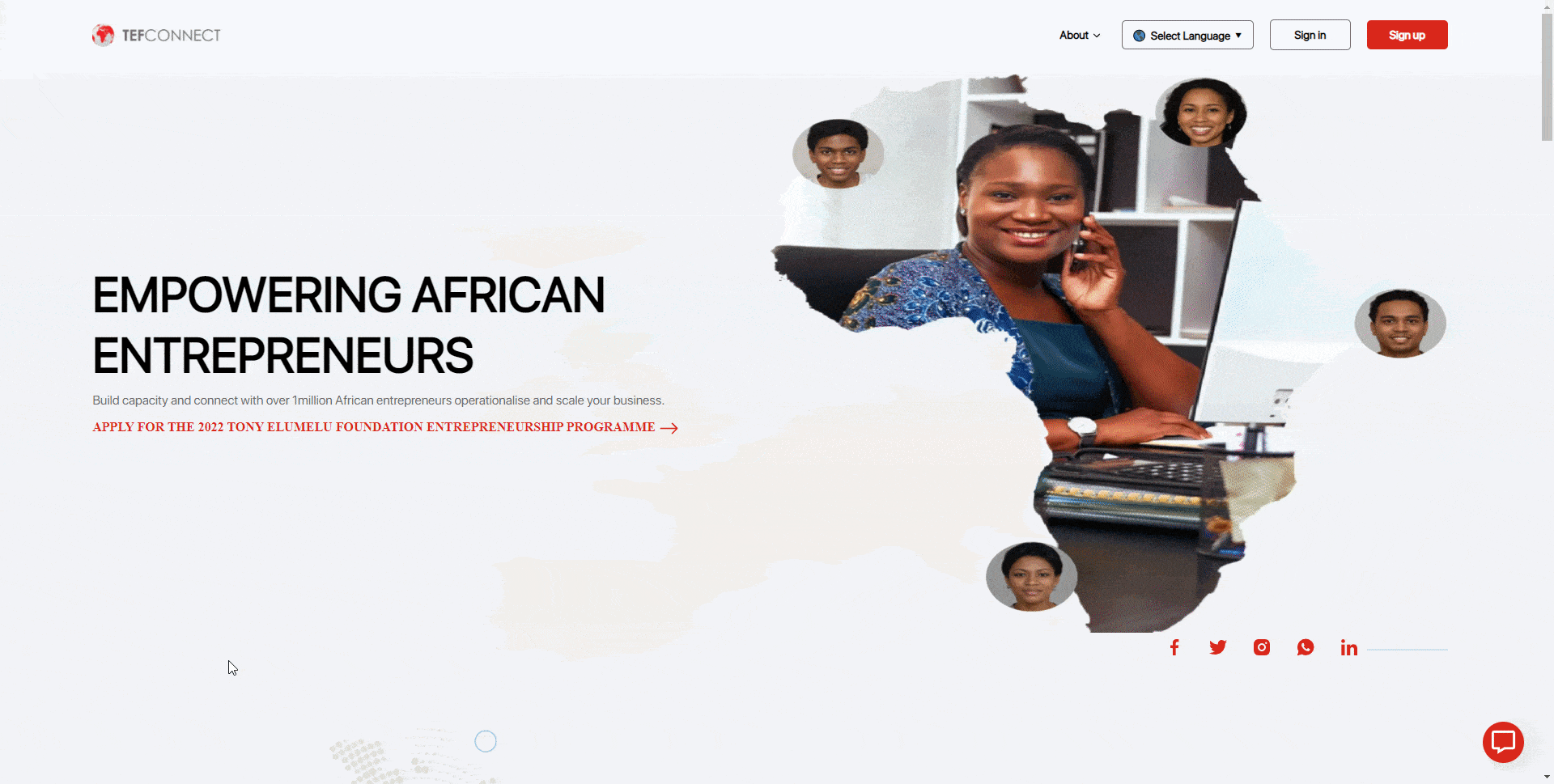
TEFConnect
Improving the usability of a social network empowering African entrepreneurs — from hidden login flows and broken features to a delightful experience with 100% task completion rate.
Role
Senior UX Designer
Team
Solo designer +
2 devs
Tools
FigmaDesign & prototyping
Google WorkspaceDocs & sheets
QualtricsSurveys
Timeline
12 weeks
W1W4W8W12
DiscoverAnalyzeDesignValidate
Designed for
desktop
TL;DR — The Outcome
What shipped
- Evaluated TEFConnect against Nielsen's 10 usability heuristics
- Identified critical issues via PESTLE analysis of 12 stakeholders
- Delivered a redesign across 4 iterations and 27 screens
- 100% task completion rate in usability testing
My role
- End-to-end user research and usability testing
- Identified issues through heuristic evaluation
- Created high-fidelity prototype integrating data-driven recommendations
Timeline
12 weeks (Mar – Jun 2022)
100%Task completionIn usability testing
27Screens redesignedAcross 4 iterations
51Survey responsesQualtrics questionnaire
18Cups of coffeeThe real metric
Next case study