Work/
User ResearchVisual DesignPrototyping

KIA My Sales

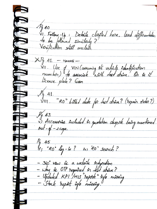
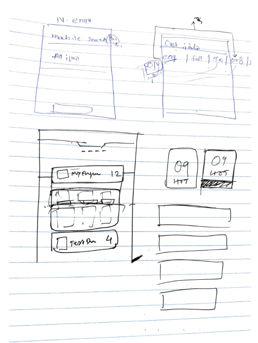
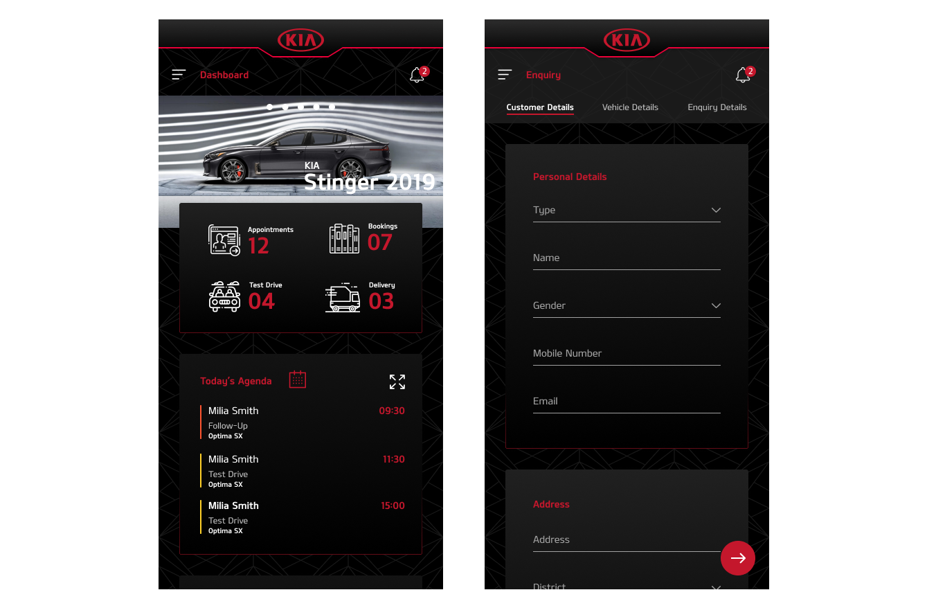
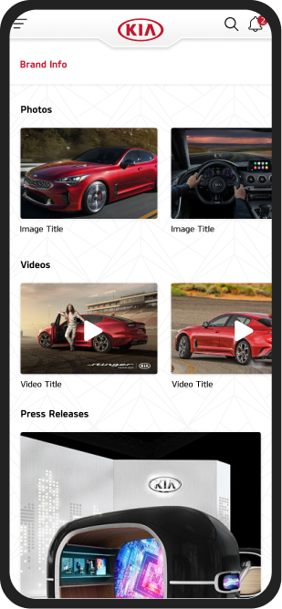
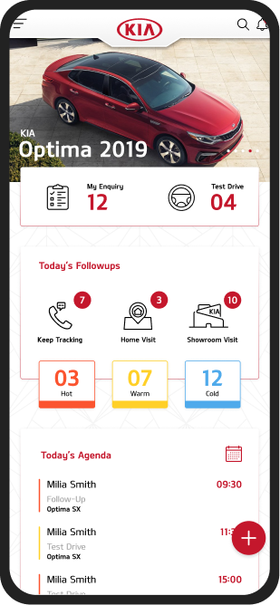
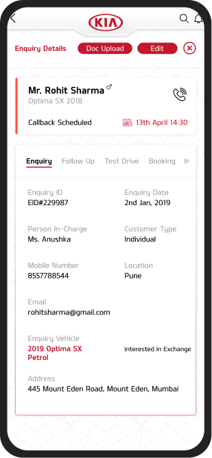
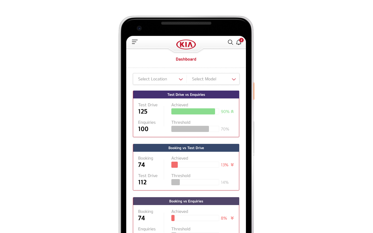
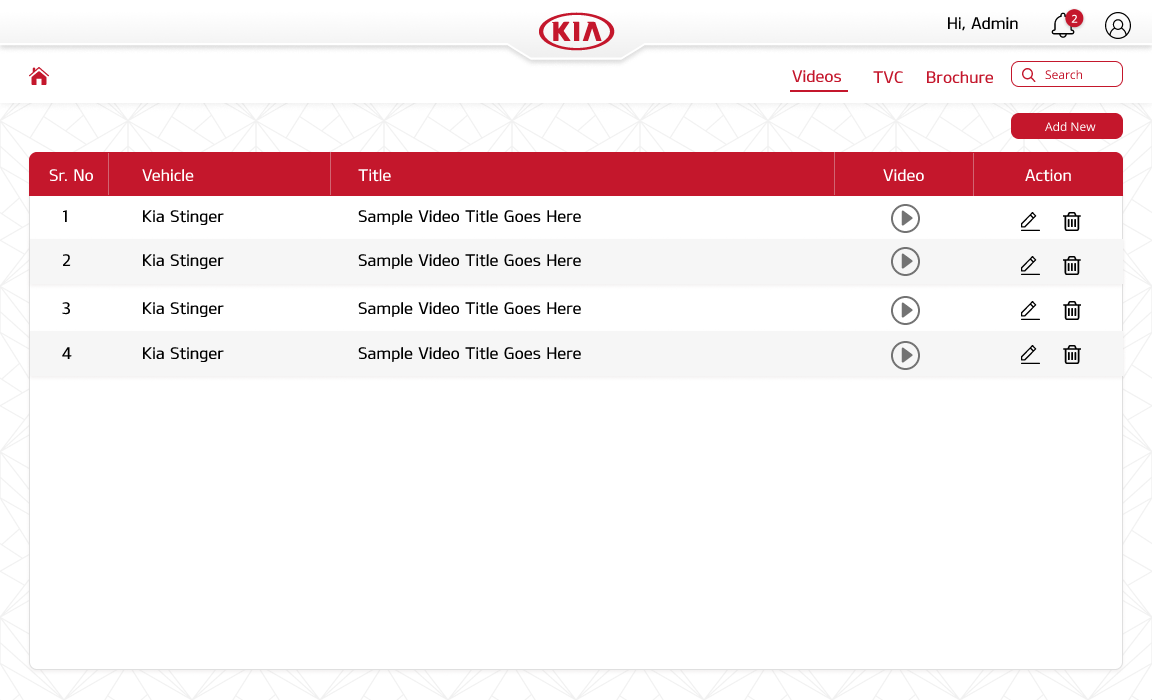
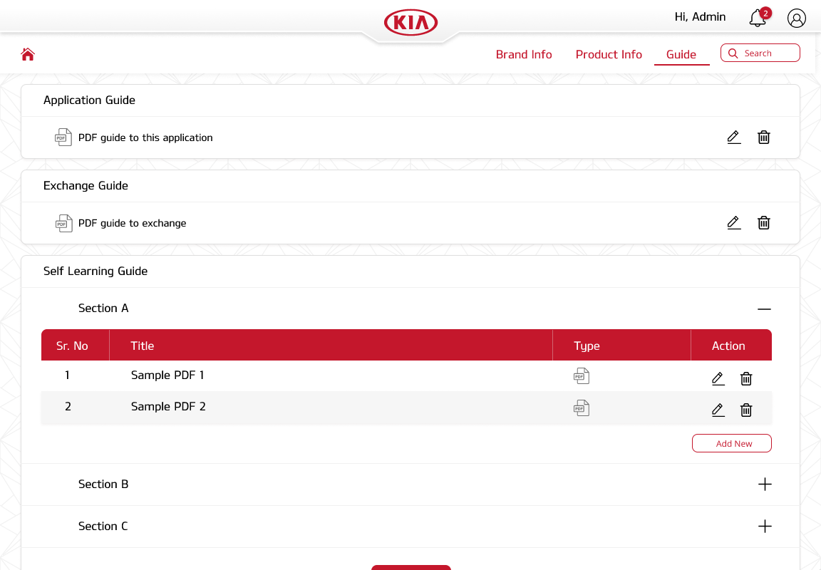
An Android app for dealers and sales teams to lookup KIA's product catalog, keep up with customer leads, follow-ups, test drives, and bookings — shipped in 3 months with 17 design iterations.

Role

Sole Designer (Intern)

Team

Solo design +

Android dev team

Tools

Figma, Zeplin, Android Studio

Timeline

3 months

Designed for
mobile
desktop

TL;DR — The Outcome

What shipped

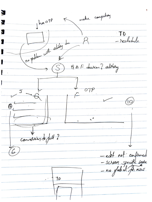
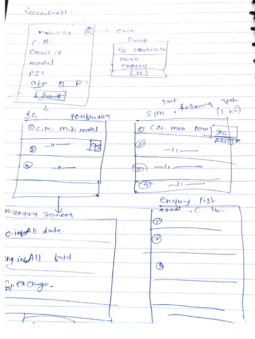
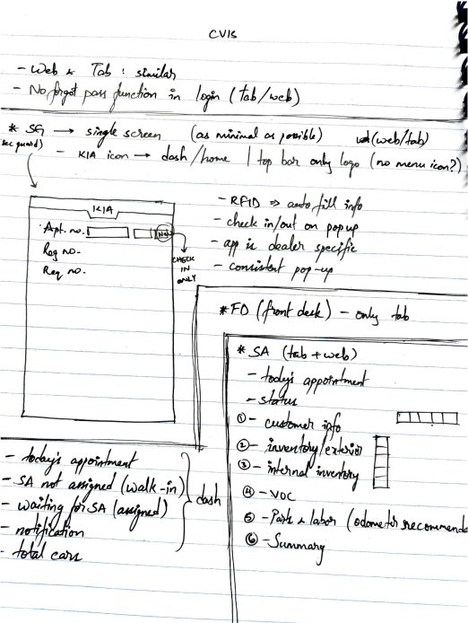
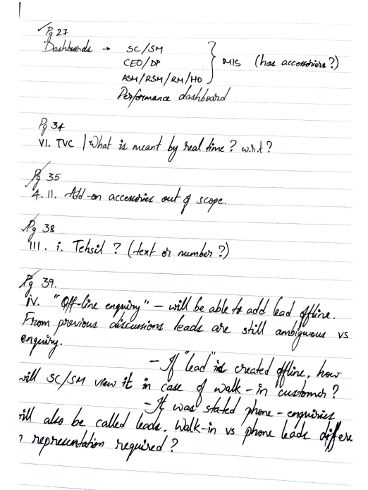
  • Shipped a live production app in 3 months, 17 design iterations
  • Rated 4.5★ on Google Play with 4/5 user satisfaction
  • Used daily by KIA dealership staff across India

My role

  • End-to-end: research, wireframing, visual design, prototyping
  • Worked under mentorship of the Founder as an intern

Timeline

3 months (KIA launched in India 2019, project within 2019–2022 tenure)

4/5User satisfactionPost-launch survey
3Months to launch17 design iterations
17Design iterationsConcept to final handoff
4.5★Play Store ratingPost-launch user reviews

01 — Context

When KIA entered India
in 2019

They weren't just launching cars — they were building an entirely new dealer ecosystem from scratch. That meant a full digital suite: customer-facing apps, internal management tools, and everything in between.

Yes, that's the old KIA logo.

If you're wondering why this case study features KIA's previous branding — good eye. This project predates their dramatic rebrand.

Designing during a brand transition turned out to be one of the more interesting constraints of this project.

The new KIA logo

Now, let's get into it.

The Challenge

Design a mobile tool that empowers KIA sales consultants to manage customer relationships end-to-end — tracking leads, scheduling test drives, browsing the product catalog, and comparing vehicles against competitors, all from their pocket.

Target Audience

KIA dealership sales consultants — people who split their day between the showroom floor and their phones. The app also needed a customer-facing mode for moments when a salesperson hands their device to a prospect.

My Role

Sole designer, owning the full design lifecycle:

  • User research
  • Wireframing
  • Visual design
  • Prototyping

This was early in my career — an internship under the company's founder. The scope was big for an intern, and that's exactly what made it formative.

Translating Business Requirements
into Design Constraints

KIA came to the table with a detailed feature list and firm expectations. The mobile form factor was non-negotiable. Rather than seeing rigid requirements as limitations, I treated them as guardrails — the design challenge became: how do you make a dense, feature-heavy app feel intuitive on a small screen?

Information Architecture

With this many modules — leads, catalog, comparisons, bookings, notifications — a clear IA was critical before touching any screens. I mapped the entire app structure to ensure every flow had a logical entry and exit, and that the navigation model could scale as KIA added features.

02 — Research

Guerrilla research, dealer-style

?!
H
T
M
S

KIA hadn't launched in India yet...

Which meant there were no KIA salespeople to interview. So I got creative.

I walked into Hyundai, Honda, Maruti Suzuki, and Toyota dealerships posing as a car buyer. The goal was deliberate: observe how sales consultants interact with customers, what tools they reach for, where they fumble for information, and how they use (or avoid) their devices mid-conversation.

Field notes and early sketches

Research notes — page 1
Research notes gallery 2
Research notes gallery 3
Wireframe sketches
App flow sketches
Screen layout sketches

03 — Insights

What the research
actually revealed

$

Instant information access

Customers ask surprisingly specific questions on the showroom floor. Salespeople needed vehicle specs, pricing, and availability at their fingertips — not back at a desktop across the dealership.

3

Lead tracking and alerts

Sales performance is measured by conversions. Consultants needed timely follow-up reminders and a clear view of their pipeline — missing a callback could mean losing a sale.

VS

On-the-fly comparisons

Some salespeople can rattle off specs from memory. Most can’t. When a customer asks ‘how does this compare to the Creta?’, the answer needs to be immediate and credible.

04 — Design

Designing the app's header

I wanted the app to feel unmistakably KIA from the first pixel. Take a look at their vehicles — specifically the front grilles. Notice anything?

KIA Soul front grilleKIA Stinger tiger nose grilleKIA Sportage diamond grilleKIA Cadenza grille closeupKIA Forte front grille redKIA Niro front grille dark

The “tiger nose” signature

Every KIA vehicle shares this distinctive grille shape — their “tiger nose” design language. I saw an opportunity to carry that physical brand DNA into the digital experience.

The header, born from the grille

The app's header mirrors the tiger nose curve — a subtle nod that makes the app feel like a natural extension of the brand. KIA's design philosophy draws from the tiger: powerful, adaptive across segments. The header captures that same energy in a digital form.

KIA My Sales app header — tiger nose curve with KIA logo

Working within the
brand system

Maintain Exclusion Zones

KIA logo

KIA MOTORS

The Power to Surprise

Maintain Exclusion Zones

KIA logo

KIA MOTORS

The Power to Surprise

Kia Red

#BB162C

Kia Gray

#7E8083

KIA logo

KIA's brand guidelines were my foundation

KIA was mid-transition — moving from a 3D-heavy visual identity toward flat design. That made this a fascinating moment to be designing for the brand. In hindsight, there was a real opportunity to build a full design system, but the timeline didn't allow for it.

My north star for visual design was clear: every screen should feel like it belongs to KIA, even without the logo visible.

A deliberate icon system

Most screens in this app are information-dense. Solid icons would have competed with the content for visual attention. Line-style iconography was a deliberate choice — lightweight enough to guide without overwhelming, while maintaining clarity at small sizes.

End
Start
OTP
Experimental dark mode designs

Pushing beyond the brief

Dark mode was gaining momentum across the industry, and I was curious what it could look like for KIA. I developed a full dark mode concept on my own initiative. It didn't ship in v1 — the development timeline couldn't absorb it — but it planted a seed for the next iteration, and showed the client what was possible.

05 — The Product

Meet KIA My Sales

Compare screen — vehicle specs
Dashboard — KIA Optima 2019
Enquiry details — customer info
App screen — notifications
App screen — vehicle catalog
Map — dealership locations
App screen — test drive booking
App screen — lead details
Brand info — photos and videos

Interactive Figma Prototype

The lead management core

At its heart, My Sales is a lead management tool — tracking prospects, scheduling follow-ups, booking test drives, and reserving vehicles. Every interaction a salesperson has with a customer flows through this system.

Design questions I kept coming back to:

  • “How does a salesperson see their full pipeline at a glance?”
  • “How do they manage appointments without leaving the app?”
  • “Can adding a new lead be done in under 30 seconds?”

Beyond leads —
tracking performance

Dealership managers needed more than a lead tracker — they needed visibility into how their teams were performing. I designed a sales performance dashboard that distilled raw numbers into actionable KPIs: enquiries generated, test drives booked, follow-ups completed, and vehicles sold.

KPI Dashboard design iterations — from card-based overview to detailed KPI comparison views

Three dashboard iterations side by side — card-based KPI overview, progress bar layout, and compact comparison view

Sales Dashboard

Monthly Performance

Live

Enquiries

+12%

142

Test Drives

+8%

87

Bookings

+15%

34

Follow-ups

+5%

203

Dealer-wise breakdown

1Hyderabad Central
85%
2Mumbai South
72%
3Delhi NCR
68%
4Bangalore MG Road
61%

17 iterations weren't just on screens

The dashboard went through its own design evolution. Early versions used dense data tables with inconsistent color coding — managers struggled to parse what mattered. Each iteration refined the visual hierarchy:

v1–v3

Raw data tables with color-coded rows — too much noise, key metrics buried in dense grids

v4–v8

Introduced KPI summary cards at the top, simplified the table below to show only actionable items

v9–v12

Added dealer-wise breakdowns and trend indicators so managers could spot underperformance instantly

v13–v17

Polished the color system — moved from arbitrary hues to a tonal violet scale aligned with KIA's brand

Full overview of MIS dashboard design iterations across 17 versions

The full scope of dashboard iterations — evolving from dense data tables to a refined, color-coded KPI system

The other half of
the product

My Sales wasn't just an app — it was an ecosystem. Behind every product brochure, training video, and vehicle spec that sales consultants accessed on their phones sat a web-based admin CMS. I designed this companion panel so KIA's marketing and training teams could manage all content without developer involvement.

admin.kiamysales.in/content

Video Management

+ Add Video
TitleCategoryStatusActions
Seltos 2022 WalkthroughProduct DemoPublishedEdit · Delete
EV6 Launch FilmTVCPublishedEdit · Delete
Sales Training Module 3TrainingDraftEdit · Delete
Sonet Feature HighlightsProduct DemoPublishedEdit · Delete
Figma design — Video management admin panel with CRUD table

Video management — CRUD interface for product demos and training content

Figma design — Guide management with Application, Exchange, and Self Learning sections

Guide management — Application, Exchange, and Self Learning modules

Product Catalog

Vehicle specs, pricing, color options, and comparison data — updated by marketing, consumed by sales reps on the app in real-time.

Training Guides

Application guides, exchange guides, and self-learning modules that onboard new hires and keep existing staff current on product changes.

Media & Brochures

TVC ads, product demo videos, and downloadable brochures — everything a salesperson might pull up mid-conversation with a customer.

Designing the CMS changed how I think about products. The mobile app was the visible output, but the admin panel was the engine. Without clean content workflows, the app's catalog and training sections would have gone stale within weeks.

Shipping meant constant feedback

With a 3-month timeline and 17 iterations, the design process was anything but linear. Weekly stakeholder reviews with KIA's business team meant presenting work-in-progress designs, defending decisions, and adapting on the fly. Some sessions redirected entire features.

Developer handoff was equally iterative. Working closely with the Android team, I learned which design choices were costly to implement and which were trivial — that back-and-forth made the final product more practical without sacrificing intent.

Weekly

Stakeholder design reviews with KIA business team

Ongoing

Developer collaboration and feasibility checks

17 rounds

Design iterations from wireframes to final handoff

Post-launch

Play Store reviews and user satisfaction surveys

06 — Impact

The impact on
KIA's business

The numbers speak clearly

KIA had zero dealer infrastructure in India before 2019 — no showroom tools, no sales apps, no digital playbook. My Sales was built from scratch alongside the brand's entire India launch, and it became the backbone of daily dealership operations from day one.

The app is live on India's Google Play Store, holding a 4.5 ★ rating across 1,000+ reviews.

What users consistently praised:

  • Intuitive navigation and visual polish
  • The breadth of functionality in a single app

Where there's room to grow:

  • Some backend friction — login issues and server connectivity — falls outside the design scope but impacts the overall experience.

The app continues to be a daily tool for KIA sales consultants across India, helping them manage leads, close deals, and stay organized.

KIA

Kia My Sales

Kia India

4.5★

1K reviews

11 MB

Size

3+

Rated for 3+

10K+

Downloads

Ratings and reviews

4.5

★★★★☆

1,083

5
4
3
2
1

3

Months

17

Design iterations

10K+

Downloads

4.5

Play Store rating

07 — Reflection

What this project taught me

This was one of my earliest projects — and easily the most ambitious. Coordinating across leadership, business, development, marketing, and design as an intern was intense. But that pressure shaped how I work today: comfortable owning end-to-end delivery, fluent in cross-functional collaboration, and genuinely energized by the complexity of shipping a real product that people use every day.

1

Design systems aren’t optional at scale

With 17 iterations across dozens of screens, I felt the pain of not having a unified component library. Every change rippled manually. If I could redo this project, establishing a design system would be my first move.

2

Designing for someone else’s workflow requires living in it

Walking into competitor dealerships as a fake buyer taught me more than any brief could. Understanding how sales consultants actually work — the interruptions, the improvisation, the device-juggling — changed the design fundamentally.

3

Working within an evolving brand builds flexibility

KIA was mid-rebrand during this project. Designing for a visual identity that was itself in transition forced me to make decisions that were principle-driven rather than pixel-perfect — focusing on what “feels KIA” rather than matching a static style guide.

Next case study

Locally

Vamsi Karuturi

Senior UX Designer

© 2026 Vamsi Karuturi. Crafted with intention.